
Prompts for AI Website Builders: v0, Lovable, Bolt, Cursor
What v0, Lovable, Bolt and Cursor each need in a website prompt, a six-question brief written for all four, and worked examples from our prompt library.
An AI website builder produces a good site when the prompt makes the decisions the builder cannot make for you: the typefaces, the colour tokens, what each section is for, the one interaction that makes the page memorable, and what the page should not look like. v0, Lovable, Bolt and Cursor all take a brief like this, but they read it at different levels, so the same words need arranging differently for each. This guide covers what each tool needs, a brief structure written for all four, and three worked examples built from prompts in our library.
If you are still choosing between the four, the v0 vs Lovable vs Bolt vs Cursor comparison covers output quality and who each tool suits. This post is about what to write into the prompt.
What each builder needs from the prompt
The four tools work at different scales, so the brief has to change with them.
v0 works one component at a time. Give it a single section and name the component, where it lives and what it exports. Name the stack, including Tailwind and any component library you use, because v0's default look is the shadcn/ui look and your prompt has to override it. Fonts and colours need to be named outright, not implied.
Lovable builds a whole app from a description. The brief needs the page list, the copy for each page and the data behind any interactive part: what a form does with each entry, what a toggle changes. Iteration is conversational, so the first prompt should set the structure and later prompts should be small and scoped.
Bolt is full-stack. Say which parts are the marketing page and which need a backend. A waitlist that stores emails, a checkout that calls a payment provider and an admin view are three different jobs, and each should be described with what it stores or sends. Never paste live secret keys into a prompt. Describe the variable name and where it goes.
Cursor works inside your repository. It reads your existing files, so the prompt should point at them rather than re-declare them. "Match the spacing and colour tokens in tailwind.config.js" is a better instruction than repeating the hex values, because it keeps the new section consistent with what is already there.
A brief structure written for all four
A prompt that gets a site-quality result answers the same six questions, roughly in this order. Adjust the wording for each tool, but keep the questions.
The full six-part version, with a tech-stack line and an output contract, is in the AI prompt engineering framework for web design. The list above is the shorter version for working across tools, and the one to keep open while you write.
Worked example 1: a SaaS hero in v0
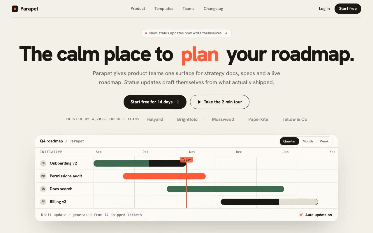
Parapet is a planning workspace for product teams. Its signature moment is an odometer headline, and the prompt opens by naming it:
"The signature mechanic is an odometer headline: one verb in 'The calm place to ___ your roadmap.' rolls vertically through 'plan', 'write' and 'ship' on a 1.6s loop, while a live roadmap panel below the copy draws its bars in on load."
For v0, the prompt works as a component brief, with one adjustment. The spec asks for a font link in index.html. A Next.js project usually loads fonts in its root layout, so tell v0 where your fonts live. Keep the palette block as named tokens. If the first result drifts back to a default look, a missing "avoid" line is a common cause, and usually a better fix than a longer prompt.
Worked example 2: a form with a backend in Lovable or Bolt
A contact form looks simple, which is why it goes wrong in app builders. The visual part is easy. The part the builder has to guess is where the entries go and what the visitor sees afterwards.
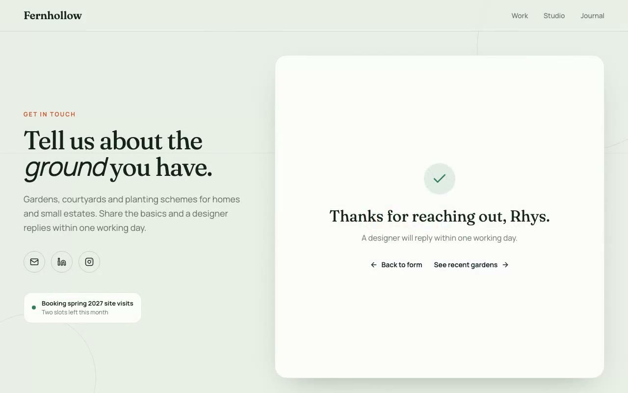
Fernhollow, a garden design practice, shows the visual half. Its signature moment is a live brief: the enquiry form fills itself in, field by field, while the page is untouched, and a progress meter counts the five required answers as they land.
That animation is front-end only. In Lovable or Bolt, write the backend as a separate prompt so the builder never mixes the two:
"Store each enquiry in a table called enquiries with name, email, project type, budget, brief and a created_at timestamp. Check that the email is well-formed and the brief is at least 20 characters. On success, show the confirmation panel. On failure, keep what the visitor typed and show the error beside the field."
Keeping the animation and the submit logic in separate prompts means a change to one doesn't break the other.
Worked example 3: a pricing section with state in Cursor
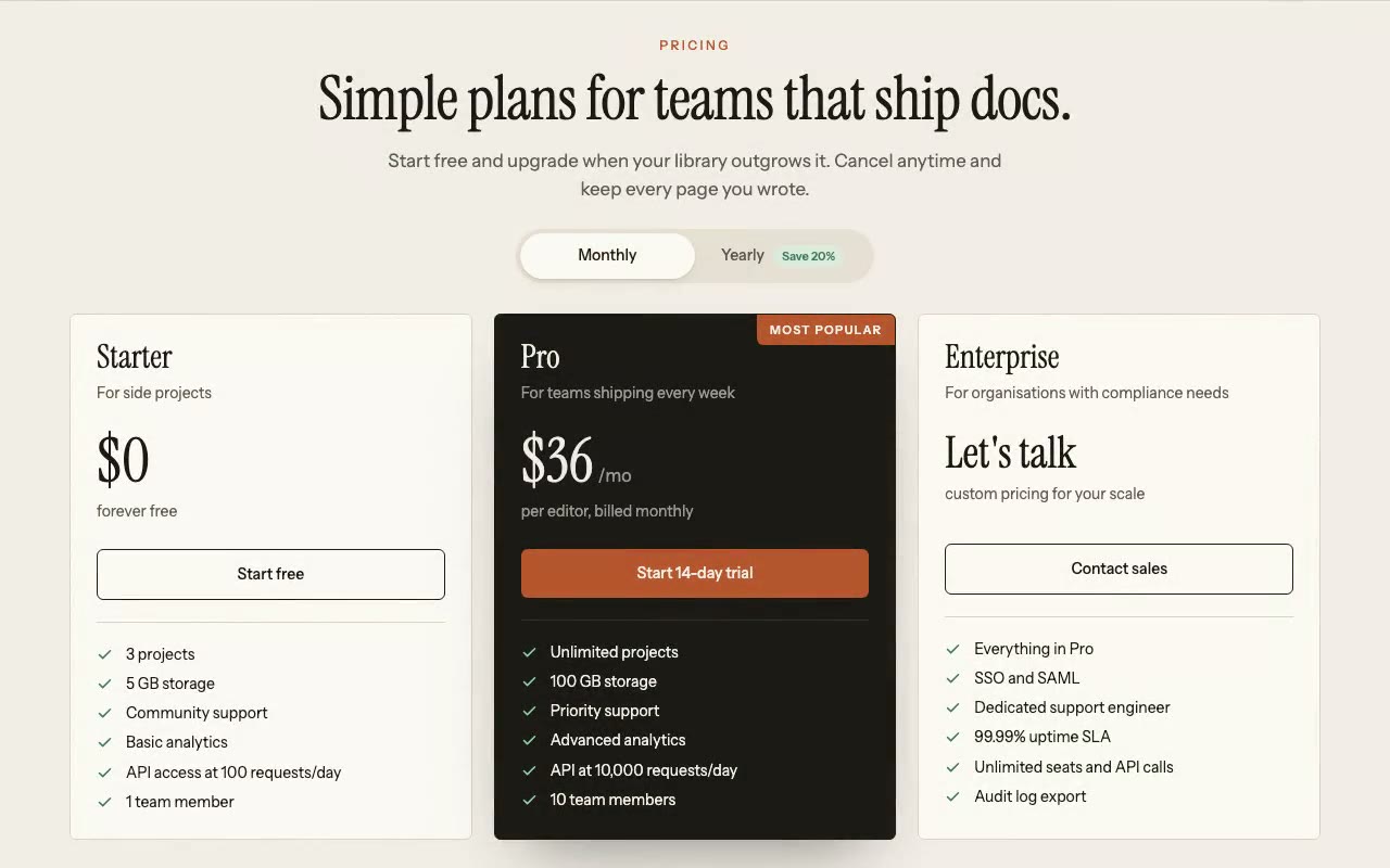
Plinth, a documentation platform, has a pricing section whose billing toggle runs itself on load. The prompt describes the mechanic precisely: the pill slides from Monthly to Yearly, the Pro price rolls down to its annual figure, and after a beat it slides back, looping until the visitor takes control with a click.
In Cursor, most of the prompt carries over unchanged. The closing lines are what make it fit your project:
"Use the existing button and card styles in this repo. Use the tokens in tailwind.config.js. Add no new dependencies."
Point at your own component names wherever you have them. A pricing section that matches the rest of the site is worth more than one that is slightly more impressive in isolation.
Mistakes that cost you in every tool
Which tool for which brief
Whichever tool you use, start with one section. Get it right, then carry the brief structure over to the next. You can browse the SaaS prompts for hero and feature starting points.
FAQ
Is one prompt enough to build a whole website in an AI builder?
Rarely. One prompt can produce a page, but the sections tend to come out at the same average level. Build the foundation (fonts, colours, layout), then one section per prompt, and assemble them at the end.
Do the same prompts work in v0, Lovable, Bolt and Cursor?
The brief is written to carry across them. What changes is the scope. Use one section for v0, the whole product for Lovable and Bolt, and your existing files for Cursor. Stack lines may need small edits to match what each builder generates.
Can I use HeroPrompts prompts in Lovable or Bolt?
Yes. Paste the visual part of the prompt as the page brief, then describe any backend in a separate prompt. If the builder generates a different stack from the one named in the prompt, say so in one line and keep the rest.
How long should a website prompt be?
Long enough to specify every decision the builder would otherwise make. A single section usually needs a few hundred words, and a full page needs more. Length matters less than whether each sentence names something specific.
What should never go into a website prompt?
Live API keys, passwords or customer data. Describe the variable name and where it is set, then add the value in the builder's own settings. If you are new to prompting in general, how to write Claude prompts for web design walks through the chat-based version of this same discipline.
Build a starter hero prompt in four questions with the free generator, or copy five prompts from the library with no account.
Get the next guide by email
New hero prompts and practical AI design guides like this one, when they go live. No spam, unsubscribe any time.
By signing up you agree to receive these emails. See our privacy policy.
Prompts from this article
Parapet — Modern SaaS Hero
Light, paper-toned SaaS hero with an odometer headline that rolls plan, write, ship, and a live roadmap panel whose bars draw in with a sweeping today marker. Built for product teams and planning tools.
Fernhollow — Contact & Project Enquiry Form
A garden studio's contact page where the enquiry form fills itself in while the visitor is idle, with a progress meter counting five required answers. The first real interaction hands control to the visitor. Built for studios, consultancies and service businesses that take project enquiries.
Plinth — Pricing Section with Annual Toggle
A branded three-tier pricing section for a docs platform, with a Monthly/Yearly pill that runs itself on load, a rolling Pro price, and a highlighted plan. Built for SaaS teams that want pricing with personality.
The prompts in the HeroPrompts library are engineered at the level of detail described above — every font, colour, interaction, and animation specified. Skip the iteration and ship a hero section that looks like it cost money.
Adapting One Landing Page Brief for Six AI Tools
How to adapt one detailed landing page brief for Claude, ChatGPT, v0, Cursor, Lovable and Bolt: what to keep fixed, what to change, and what to check.
ToolsThe Best AI Tools for Web Design in 2026
AI web design tools have splintered into distinct categories — chat assistants, visual builders, and code editors. Here's what each actually excels at.
Toolsv0 vs Lovable vs Bolt vs Cursor: Which AI Tool Builds the Best Landing Pages?
An honest comparison of the four leading AI site-building tools for landing pages — what each is actually good at, where each falls short, and how to get the best output from any of them.