
Cybersecurity Website Design: Hero Examples That Earn Trust
What makes a cybersecurity website credible, with Sentinel's live threat-feed hero as a worked example, plus trust-signal rules and related SaaS prompts.
A cybersecurity website earns trust when it shows the product working and backs up every claim it makes. Padlocks, hooded figures and blue-grid backdrops tell a buyer nothing and look like every other security vendor. The hero that works shows a live-looking security operation with specific, believable detail, names the standards it meets precisely, and offers a route to documentation for anyone who wants to check. Sentinel, one of our enterprise security prompts, is built on that idea. Its code shows the choices in concrete form.
What enterprise security buyers look for above the fold
Security buyers are checking for a few things in the first screen, whether or not they say so.
Replace the padlock with the product
The default cybersecurity hero is a stock image. The stronger version is the product's own surface. Sentinel's right-hand column is a dashboard mockup labelled "sentinel-ops · production", with four stat cards, three compliance rings and a live threat feed. Its spec describes the feed as one that "prepends a new blocked, alert or info event every 3 seconds, with severity badges and clock timestamps".
The detail is what makes it credible. The feed does not say "Threat detected". It says things like:
"Credential stuffing: 847 failed logins on /v2/auth"
"XSS payload in form field /checkout"
"DDoS mitigation active: 12K req/s absorbed"
Specific messages read like real operations. Generic ones read like a template. When you write feed copy for your own hero, use the attack types, endpoints and numbers your product actually handles, and remember that every number on the page is a claim.
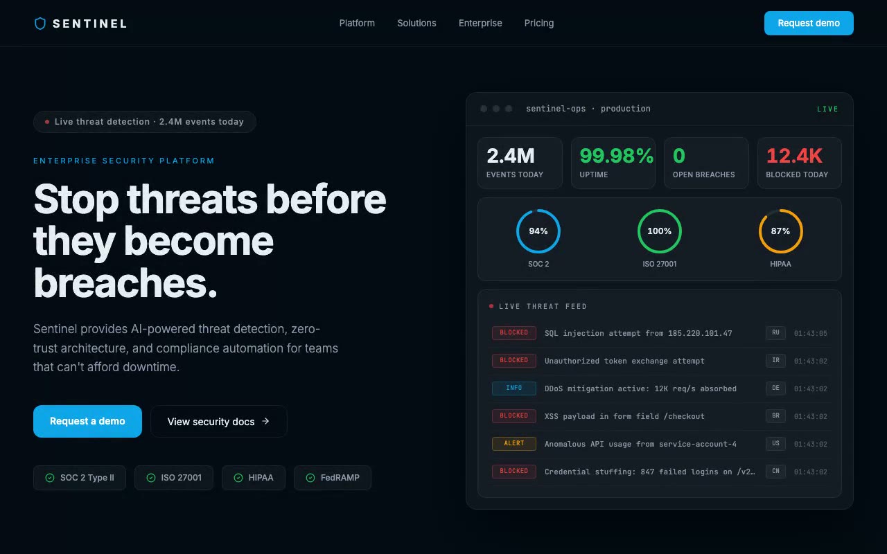
The stats and figures in Sentinel's prompt are placeholder demo values, not claims about any real product. Replace them with your own measured numbers before launch, or drop any figure you cannot support.
Trust signals that earn credibility, and the ones that backfire
Earn it: named standards you actually hold. "SOC 2 Type II" and "ISO 27001" are specific. A reader can look them up and ask about the report or the certificate. Sentinel's compliance row shows SOC 2 Type II, ISO 27001, HIPAA and FedRAMP as check-marked badges.
Backfire: badges you cannot back up. A badge is a factual claim. FedRAMP is a specific authorisation for US federal cloud services, and SOC 2 Type II is an audit report with a defined period. If you do not hold one, delete the badge. A missing badge costs you less than a claim that falls apart in a procurement call.
Handle HIPAA carefully. HIPAA has no certification body, so "HIPAA certified" is not a meaningful cue. What you can say honestly is what you have done: that you will sign a Business Associate Agreement, or that your controls are designed for HIPAA-regulated data. Word the badge to match.
Backfire: a logo wall you have no permission to show. Sentinel's trust bar uses five fictional company names. They are there to show the layout, not to claim customers. Before launch, replace them with customers who have agreed to be named, or remove the row.
Backfire: precision without a source. An uptime figure to four decimal places reads as authoritative until someone asks where it comes from. If you show uptime, link to a status page.
Caution with progress rings. Sentinel's rings show 94%, 100% and 87% for three frameworks, which reads like audit progress. If you use rings, define what they measure in a small caption, or use status text such as the audit year and the scope instead.
Make the motion calm
Security sites need motion that reads as watchful, not alarming. Sentinel's feed updates every three seconds, and its colours carry meaning: red for BLOCKED, amber for ALERT and blue for INFO. The restraint is deliberate. The feed slides rows down rather than flashing them in, and it stops updating while the pointer is over it or focus is inside it, so a reader can finish a line.
The spec also describes what reduced motion looks like: no interval and no transitions, with the rings and counters showing final values and the feed frozen on its seed rows. That is the state a reviewer or an accessibility audit will see, so it should look finished.
Other SaaS prompts that fit a security or trust brief
Several other prompts in the library suit products where the buyer needs to believe the answer.
Sentinel itself does use navy and sky blue, which is the category default. What sets it apart is the density of specific, live-looking detail, not the palette. If you want to stand out from the category, change the palette first. The spec-driven approach works with any tokens you define.
A checklist for a cybersecurity hero
If you are building the section with an AI coding tool, the workflow for building a site section by section covers how to turn a spec like Sentinel's into a working component without losing the detail. For the wider library, browse the SaaS prompts.
FAQ
What should a cybersecurity website hero show?
Show the product working. A live-looking dashboard, a threat feed or a status view with specific data does more than a stock image, because it tells the visitor what the product does. Pair it with one line that names the buyer, and two calls to action: a demo request and a route to security documentation.
Should I use stock photos of hackers or padlocks on a security website?
Avoid them as the main visual. They are the default for the category, so they make your site look like every other security vendor, and they say nothing about your product. A small supporting image is fine. The hero should be the product or a clear picture of the job it does.
Which compliance badges can I put on my website?
Only the ones you hold or can document. A SOC 2 Type II report, an ISO 27001 certificate or a FedRAMP authorisation is a verifiable claim. HIPAA has no certification, so describe what you do for regulated data instead. If a badge would make a procurement reviewer ask for proof you cannot produce, remove it.
What colours work for cybersecurity website design?
Dark navy, deep charcoal and near-black backgrounds are common, and they suit a monitoring context. Use one accent for actions and a small set of severity colours for status. Colour should carry meaning in the product view, such as red for blocked and amber for alerts. Sentinel uses navy with sky blue, and the palette alone does not make it credible; the specific data does.
Is an animated dashboard in the hero a good idea for a security company?
Yes, if the motion is calm and the data is specific. Update slowly, let the reader pause the feed, and make sure the reduced-motion version shows the same information as a static screen. An animation that flashes red alerts every second reads as noise to a buyer.
Build a starter hero prompt in four questions with the free generator, or copy five prompts from the library with no account.
Get the next guide by email
New hero prompts and practical AI design guides like this one, when they go live. No spam, unsubscribe any time.
By signing up you agree to receive these emails. See our privacy policy.
Prompts from this article
Sentinel — Enterprise Security SaaS Hero
A dark enterprise hero whose live security-operations dashboard prepends a new blocked threat every three seconds while SOC 2, ISO 27001 and HIPAA rings sweep to their scores. Built for cybersecurity, compliance and B2B platforms selling to IT and security buyers.
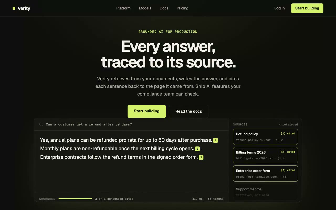
Verity — Grounded AI Platform Hero
A dark, centred AI-platform hero whose answer card streams a response sentence by sentence, attaching a numbered citation to each one and lighting its source in a side rail. Built for RAG, enterprise AI and any product where answers need to be checkable.
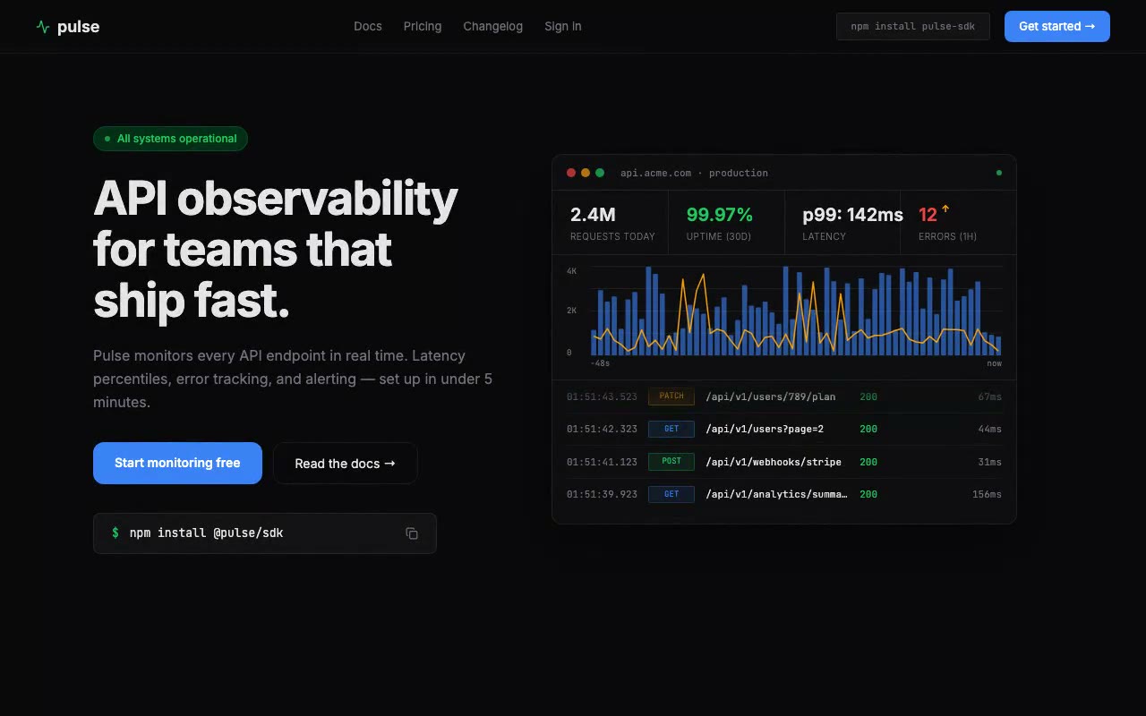
Pulse — API Monitoring Tool Hero
Developer tool hero with a live animated request graph that scrolls its volume bars and p99 latency line every 800ms, plus a terminal-style request log. Built for API platforms, SDK makers and backend teams.
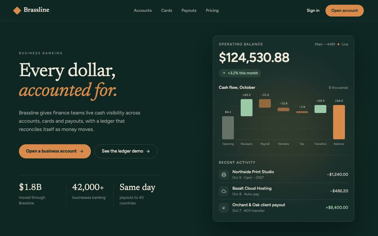
Brassline — Business Banking Hero
Split-layout business banking hero on deep forest green, with a serif headline and a cash-flow waterfall that builds itself as the operating balance counts up. Built for finance teams, spend management and banking products.
The prompts in the HeroPrompts library are engineered at the level of detail described above — every font, colour, interaction, and animation specified. Skip the iteration and ship a hero section that looks like it cost money.
Scroll-Driven Hero Sections: 5 Techniques and Templates to Copy
Scroll-driven hero sections tie animation to scroll position. Five techniques, how each is built, when they hurt performance, and templates with live previews.
DesignSaaS Hero Section Examples: 4 Patterns With Live Previews
Four SaaS hero patterns that prove the product is real: a working dashboard, a live number, a waitlist and trust signals, each with a live preview.
DesignE-Commerce Hero Sections That Sell: 5 Patterns With Examples
Five e-commerce hero patterns for selling one product: spotlight, editorial split, clock-driven sale, 3D viewer and signature reveal, each with a live preview.