
Animated Hero Section Examples: 12 Live Previews, Explained
Twelve animated hero sections from our library, grouped by technique. Each shows the mechanic, why it works and a prompt excerpt you can reuse.
The best animated hero sections use motion to carry one idea: a headline that decodes itself, a dashboard that is already running, a cursor that changes the page. Below are 12 from our library, grouped by technique. Each has its preview, the mechanic in one line, why it works and a short excerpt from the prompt that builds it. The timings come from the prompt files, so you can check them against the code.
How to read this gallery
Every entry follows the same pattern. The preview is a recording of a real build of that exact prompt, and the prompt page has the full prompt to copy. The mechanic is what moves and when. Why it works explains the decision behind it, and the excerpt shows how the prompt describes it. Copy the structure, not the exact values: a motion that fits a fintech product will feel wrong on a perfume site.
Text effects
1. Luminary: a scrambled headline that resolves
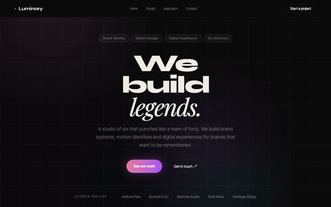
Mechanic. Each headline word starts as cycling random glyphs, then resolves left to right one letter every 80ms, with a 600ms cyan afterglow on each letter and word delays of 0, 400 and 900ms.
Why it works. The effect reads as decoding, which suits a studio that sells ideas rather than objects, and it happens in one place, so the layout never jumps. The prompt also handles the accessibility side: the visible glyphs are aria-hidden, and a visually hidden span holds the real headline for screen readers.
From the prompt. "each headline word starts as a field of random glyphs cycling rapidly, then resolves into its real letters one at a time, left to right."
2. Parapet: one verb that rolls through three states
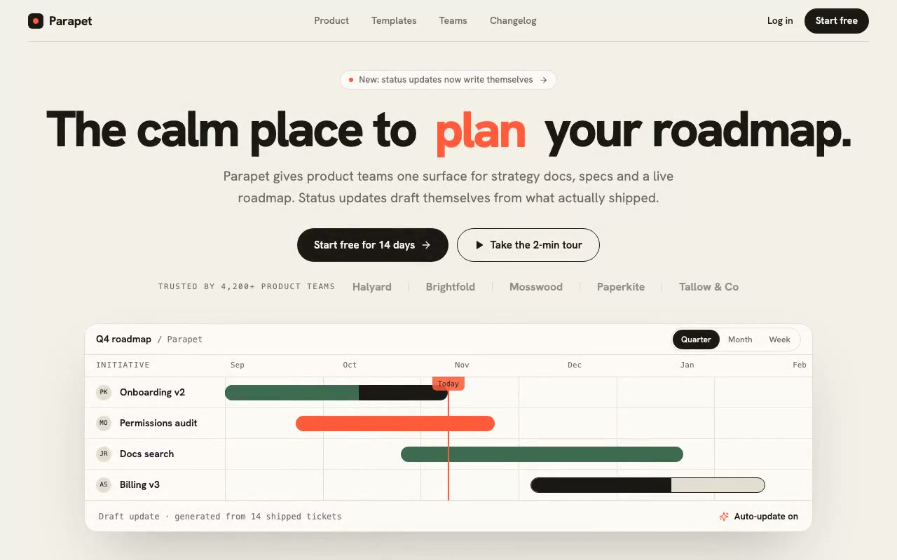
Mechanic. One verb in the headline slides up through "plan", "write" and "ship" every 1.6 seconds on a 700ms ease curve, while the roadmap bars draw in beneath it.
Why it works. Changing one word keeps the sentence stable and makes the product's three jobs visible in turn. The line height is fixed, so the rest of the headline doesn't move vertically when the verb changes. The word is decorative for screen readers, and a hidden span announces the active word.
From the prompt. "one verb ... rolls vertically through 'plan', 'write' and 'ship' on a 1.6s loop."
Live product UI
3. Flux: a currency converter that moves
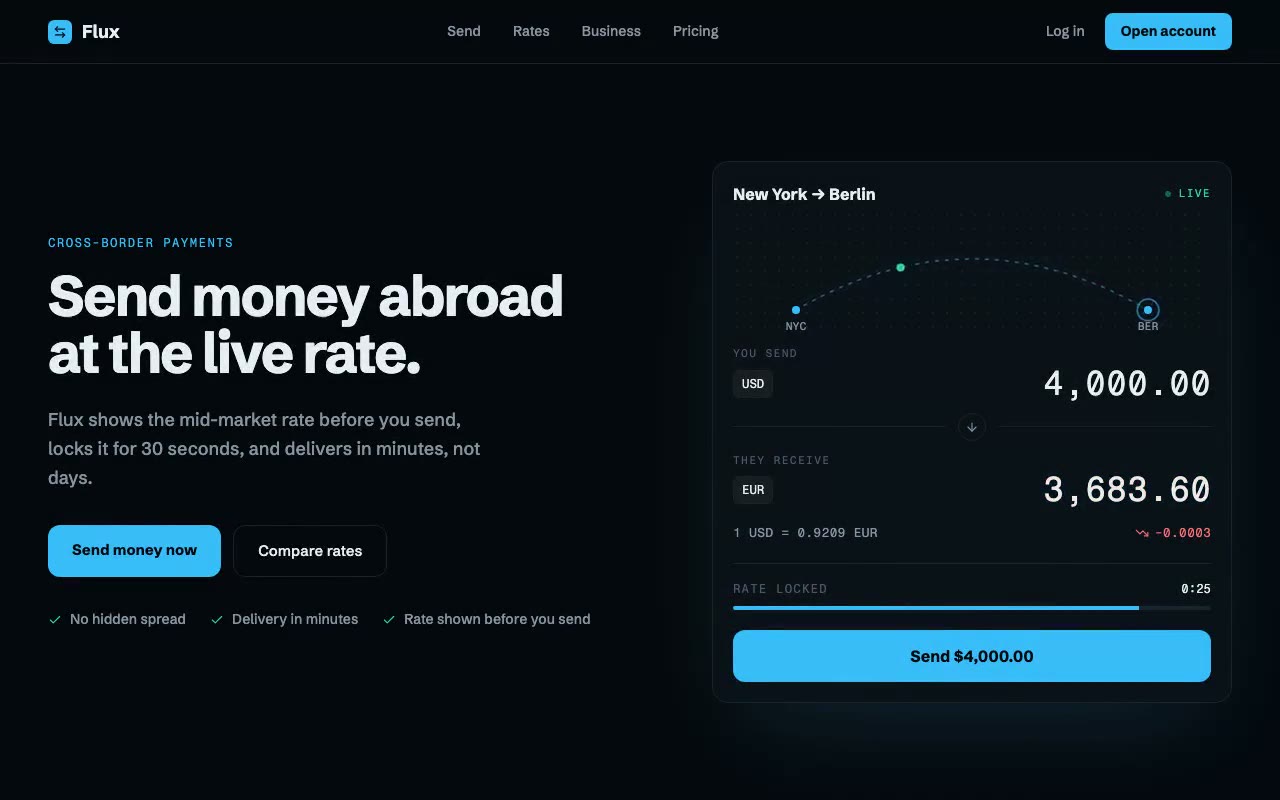
Mechanic. A converter card ticks the USD-to-EUR rate every two seconds and flashes the receiving amount, while a particle travels the New York to Berlin arc and a 30-second rate lock drains.
Why it works. The product's promise is that the rate is shown before you send and then held. The card makes that visible: the lock bar drains, and the colour of each change shows the direction of the move. The numbers use a monospaced font with tabular figures, so the digits stay put as they change. The rate sequence comes from a fixed table of eight steps, so it looks the same on every load.
From the prompt. "Rate tick index = floor(sec ÷ 2)." The whole mechanic is one timer that counts seconds, with everything else derived from it.
4. Pulse: a request graph that scrolls on its own
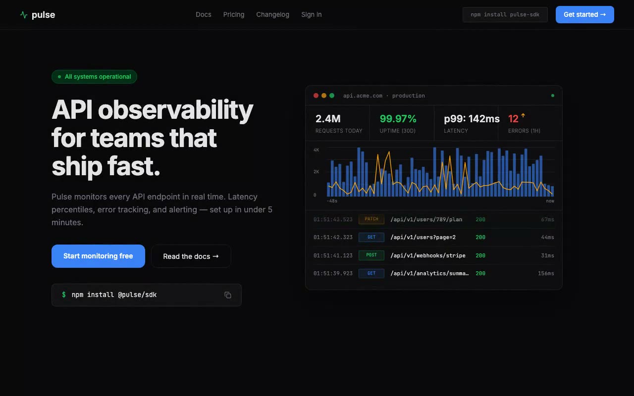
Mechanic. A 60-bar request graph gains a new bar every 800ms, so the window is 48 seconds, with an amber p99 line across it and a new log row every 1.2 seconds.
Why it works. Monitoring tools are sold on being live, and the motion is the proof. The graph runs on load with no pointer or scroll input, so the reader sees activity in the first frame. The log feed is marked role="log" with aria-live="off", so a screen reader isn't interrupted every 1.2 seconds.
From the prompt. "60 data points of simulated request volume update every 800ms, new data appends on the right while old data shifts left."
5. Verity: an answer that cites its sources as it types
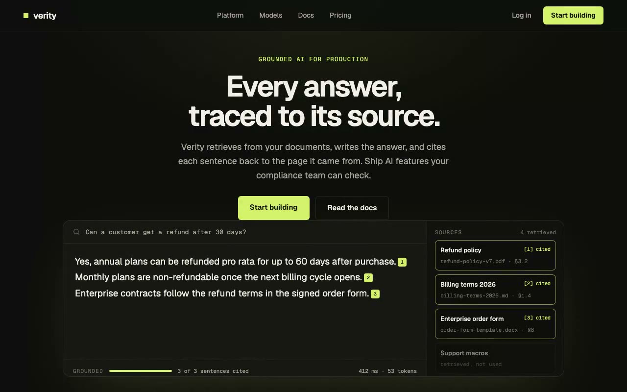
Mechanic. A streamed answer types at 22ms per character, and each finished sentence pops a numbered citation chip and lights its source card in lime.
Why it works. It shows the feature instead of describing it. The reader watches a claim get attached to a source, which is the point of an AI product that cites its answers. The timing gives each citation enough time to register before the next sentence starts. The first citation lands at about 2.2 seconds and the third at about 5.3 seconds.
From the prompt. "each finished sentence gets a numbered citation chip, and its source lights up in the rail beside the answer."
Cursor and pointer
6. Halcyon: headline letters that lean toward the pointer
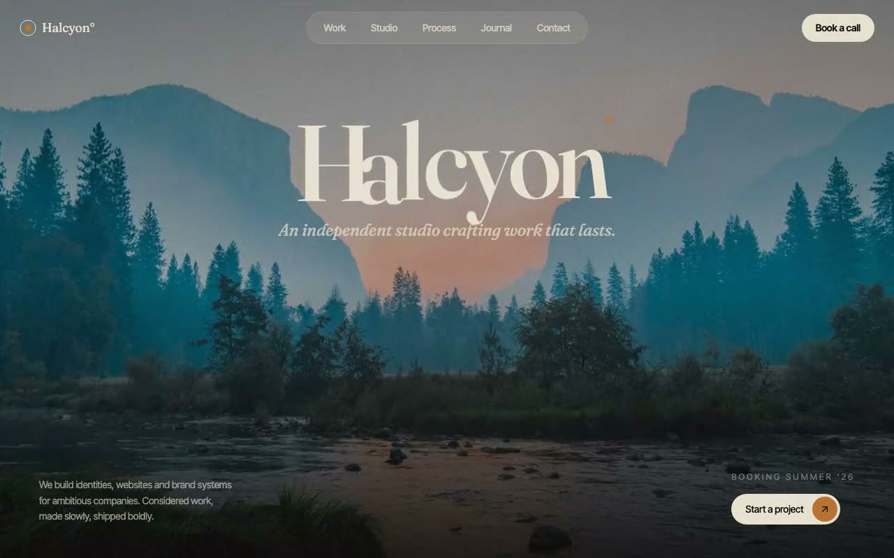
Mechanic. Each letter of the wordmark leans up to 18px toward the pointer within 140px, easing 12% of the remaining distance per frame, and a virtual pointer takes over after 1.2 seconds of stillness.
Why it works. The letters are the only interactive part, and the displacement is small enough that the word never breaks apart. The prompt makes one technical choice that matters: the magnetic transform sits on an inner span, while the entrance animation sits on the outer span. A running CSS animation overrides inline transforms, so putting both on one element would freeze the effect.
From the prompt. Each letter is "gently pulled toward the pointer within a 140px radius" and then returns.
7. Sedimenta: a contour survey the pointer can push
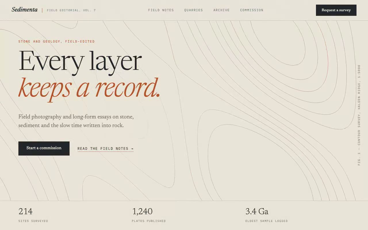
Mechanic. A canvas draws topographic contour lines from a terrain function, and a pointer or virtual probe pushes a bump through them as the terrain rises over 2.6 seconds.
Why it works. This is the one drawn effect in the set, and it gives the page an identity no CSS gradient could. The pointer behaves like a probe in a field survey, which fits a geology studio's story. The loop uses refs and never calls setState, and the grid cell is 10px on desktop and 14px below 768px to keep the sample count down.
From the prompt. "f = base + press", where press is a Gaussian bump centred on the probe.
8. Sylvie Moreau: a page colour that follows the project
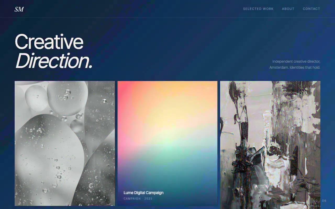
Mechanic. The page background glides over 700ms into the hovered project's two-colour gradient, and cycles through all six projects every 2.4 seconds when nobody is hovering.
Why it works. The environment reacts to the work being explored, which gives each project its own mood without a page change. The gradient stops only animate because the custom properties are registered with @property. Without that, the colour would snap instead of gliding.
From the prompt. @property --cf-from { syntax: '<color>'; inherits: true; initial-value: #0C0C0C; }
Ambient backgrounds
9. Umbral: a particle mesh that gathers near the pointer
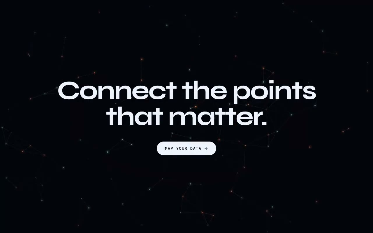
Mechanic. Glowing nodes drift and join into hairlines within 130px of each other, an attractor follows the pointer, and the line colour cross-fades on a five-second cycle.
Why it works. It gives depth without a photograph, and the attractor ties the background to the cursor without making it depend on one. Respawning nodes keep the field evenly populated. The drawing pauses while the tab is hidden, which keeps the background from spending work on a page nobody is looking at. The node count scales with screen area, clamped between 30 and 180, and drawing pauses while the tab is hidden.
From the prompt. "Respawns fade in from zero, so the field stays evenly populated."
10. Lanterna: warm bokeh with depth from speed and blur
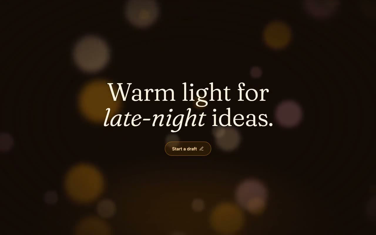
Mechanic. Twenty-six pure-CSS discs rise at different speeds, where near discs are larger, softer and faster, which gives parallax with no JavaScript loop at all.
Why it works. Depth comes from parallax, meaning near things move faster and blur more, and it costs no JavaScript at all. The reduced-motion branch leaves the discs where they were placed, which still reads as a light field. Near discs take about 22 seconds for a full rise and far discs about 38 seconds.
From the prompt. duration = (38 − 16 × z) s ÷ speed, where z is the disc's depth from 0 (far) to 1 (near).
Reveals and load choreography
11. Lindqvist: a headline pressed into place, with a counter
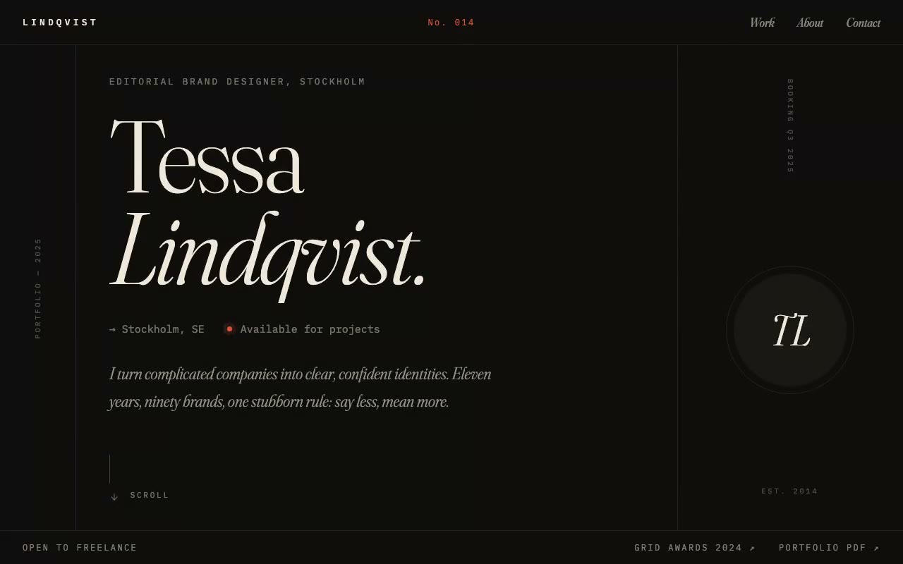
Mechanic. Two column rules draw down, the name presses into place in two clipped lines, and the nav counter ticks from No. 001 to No. 014 in one second.
Why it works. The motion borrows from print, which suits an editorial designer's portfolio. The prompt carries one detail worth copying: the mask has bottom padding, so descenders such as the tail of a "q" are not clipped. The counter only updates state when the integer changes, so it doesn't re-render on every frame.
From the prompt. "Math.round(1 + 13 × easeOutCubic(progress))" drives the counter.
12. Halvard: a shutter sweep through a lookbook
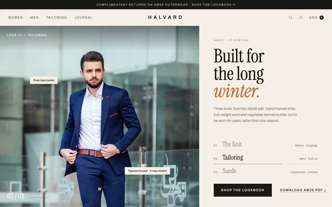
Mechanic. Six slices close and reopen to swap between three looks, each look stays for 3.6 seconds, and numbered callouts draw onto the photo after each opening.
Why it works. The slices read like the shutter of a camera or the turn of a page, which fits a lookbook. The callouts make the garments legible, so the page works as an editorial spread rather than a slideshow. Pausing on hover gives the reader control over a timed sequence. A swap takes about 1.1 seconds, and the callouts start drawing about 380ms after each opening.
From the prompt. "Dwell: each look dwells 3600ms."
How to pick one
Pick the mechanic from the product, not from what looks impressive.
For scroll-linked heroes, see scroll-driven hero sections, which covers the pinned-stage and progress techniques in more depth. For the background effects in more detail, see animated background effects without killing performance. To compare the static structure of these heroes, see SaaS hero section examples.
If you want to start from a prompt, Flux and Verity are the two to try first for product-led SaaS. For editorial work, Lindqvist is the one to study. The full library is at /browse.
FAQ
What makes an animated hero section effective?
One idea, carried by the motion, and a static state that still makes sense. The best examples in this list each do one thing: decode a word, show a live number, let the cursor change the page. The motion should explain something, and the headline should be readable before any of it runs.
Which animated hero works best for a SaaS landing page?
For a product that is about data or money, a live element such as a converter or a request graph is the strongest choice, because it shows the product working. For a product about a single idea, a headline that rolls through states is simpler and easier to keep clean.
Do animated hero sections slow down a site?
They can. The cost is in work done every frame. The prompts here keep the loops to transforms, opacity and a few SVG attributes, and they avoid storing animation state in React. Background canvases pause when the tab is hidden. Test on a mid-range phone, not only your development machine.
How do I make an animated hero accessible?
Keep the headline and the main action readable without the animation, mark decorative layers as aria-hidden, and make sure each effect has a reduced-motion branch that shows a finished state. Several of these prompts also keep the real text in a hidden span for screen readers while the visible characters animate.
Can I use these prompts in Claude, ChatGPT, Cursor, v0, Lovable or Bolt?
Yes. Each prompt is written as a build brief with the stack, tokens, timings and accessibility rules spelled out, so it is built to work in each of those tools. Paste it in as written, and check the output against the timings and the reduced-motion section before you ship.
Build a starter hero prompt in four questions with the free generator, or copy five prompts from the library with no account.
Get the next guide by email
New hero prompts and practical AI design guides like this one, when they go live. No spam, unsubscribe any time.
By signing up you agree to receive these emails. See our privacy policy.
Prompts from this article
Flux — Cross-Border Payments Hero
A dark fintech hero built around a live USD-to-EUR converter that ticks every two seconds, flashes the recipient amount green or coral with each move, and animates a New York to Berlin transfer along an arc with a 30-second rate lock. Built for payments, remittance and FX products.
Halcyon° — Independent Design Studio Hero
A cinematic editorial hero where each letter of the Halcyon° wordmark is magnetically pulled toward the cursor, with a slow-breathing dusk photograph behind it. Built for independent design studios, identity firms and boutique agencies.
Umbral — Particle Mesh Background
A canvas constellation background where glowing nodes drift under gravity and wind, link into a shifting mesh, and gather around the pointer. For landing heroes and dashboards that need depth without a 3D library.
The prompts in the HeroPrompts library are engineered at the level of detail described above — every font, colour, interaction, and animation specified. Skip the iteration and ship a hero section that looks like it cost money.
Mobile App Landing Page Hero Sections That Drive Downloads
A mobile app hero has one job: get the visitor to tap a store badge. Four hero patterns, the QR and badge details most prompts skip, and a working Flow prompt.
DesignLanding Page Hero Section Best Practices for 2026: The 7 Elements
Hero section best practices for landing pages and homepages: the seven elements every hero needs, the mistakes that cost conversions, and a checklist to use today.
GuidesHow to Generate AI Hero Images for a Landing Page (With Prompts)
Set the aspect ratio, leave room for the headline and match your palette, then use a five-part prompt that fits the frame. With a checklist and FAQ.